Table of Contents
Starting an ecommerce business is easy. But getting the attention [...]

Starting an ecommerce business is easy. But getting the attention of your customers and nudging them to buy is not.
Luckily, there are a couple of things you can do to compel customers to buy. And one of those things is working on your ecommerce web design.
Web design, in general, makes a great first impression on your business. It also allows you to build your credibility with your customers. And more importantly, an impressive web design can make your online store stand out.
However, ecommerce web design can be challenging to pull off. That’s because, more than aesthetics, it requires a deep understanding of user experience.
Nonetheless, you can start by knowing what design mistakes to avoid to generate sales for your online store.
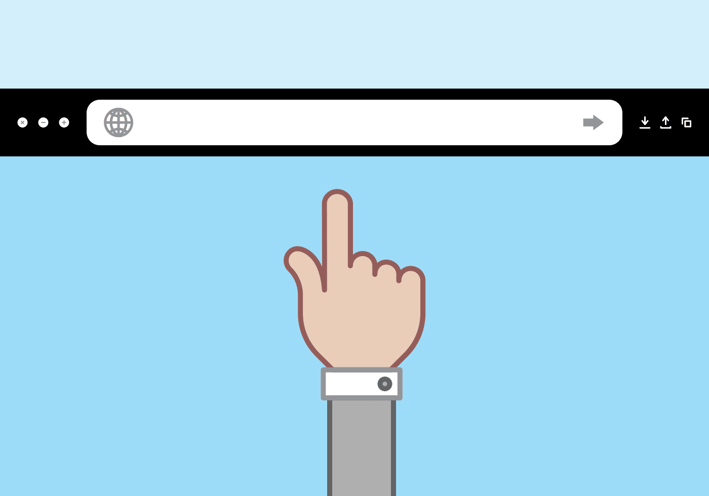
Optimizing Your Web Design
Whether you’re just starting out in web design or are a seasoned developer, there are some common mistakes everyone should avoid when planning an Ecommerce website. From desktop-only designs and missing calls-to-actions to low-quality product images, avoiding these mistakes will help optimize your website and give you a leg up on your competition.
1. Bad User Experience
As mentioned earlier, web design requires a deep understanding of user experience. That’s because UX is integral for several reasons:
- Effective UX engages your potential customers
- It impacts your marketing strategy
- It boosts your conversion rate
Here’s the thing: Your online store visitors deserve to experience the best UX as soon as they land on your site. Not only will this help increase your sales, but you can also receive positive customer reviews.
Most importantly, any website with great UX can rank well on search engine results.
2. Unclear Value Proposition
A value proposition is integral in convincing your prospect to come back to your online store. That’s because it defines what makes your ecommerce incomparable.
In relation to this, showcasing your ecommerce business’s value proposition is not limited to the content you publish. The colors and images you use on your web design can also create an impact.
Hence, when you make an ecommerce website, it would be ideal to pick a color scheme and use images that reinforce your value proposition.
3. Desktop-only Design

Over 50% of global internet traffic comes from mobile devices. Therefore, it would make sense that your ecommerce web design should be mobile-friendly. Otherwise, you’ll be missing around 60% of potential site visitors that you can turn into customers.
4. Lack of Visual Hierarchy
Visual hierarchy makes it easier for your customers to navigate through your ecommerce site. Plus, it makes your call-to-actions recognizable.
For one, visual hierarchy directs a site visitor’s eyes on the critical parts of your ecommerce content. It is like giving them a cue which of the design elements on your website is more important.
The key here is consistency. Be consistent with the color schemes you use for your foreground and background colors. The same thing goes for the text colors that you use.
In addition, it is imperative that you are consistent with your font sizes, too. Otherwise, it can ruin your entire web design layout.
5. Missing Call-to-Action
In relation to visual hierarchy, it is also vital that you know where to place your call-to-action. After all, how would your site visitors know what to do next?
Imagine reading the most compelling product description. The problem is, they cannot buy your products because they don’t know how to do so.
Mind you; many sites don’t have a prominent “Buy Now” button.
That said, it would be best to have a call-to-action button. And do not be afraid to enlarge those CTA buttons. That way, your site visitors can see it immediately.
Another tip is to use clear languages on what that particular button does. For instance, “Add to Cart” means customers can click that button if they’re ready to buy the product. “Add to Wishlist,” on the other hand, could mean that they’re still considering it.
Lastly, use bright, contrasting colors to make your CTA button stand out from various elements on your page.
6. Ineffective Product Pages
Many ecommerce businesses fail to reap results due to ineffective product pages. When we say “ineffective product pages,” we mean pages with lousy UX design and product description.
Keep in mind that the product page is one of the first pages that a site visitor will land on. Hence, it would be best if you leverage it to showcase your products.
What you can do is upload high-definition product images. Talk about the specs and how it can benefit a customer. Add customer reviews and ensure that there is a CTA button.
Doing so ensures that you can turn the majority of your product page visitors into paying customers.
7. Low-quality Product Images
Customers won’t buy your products based on word alone. You will need something that will pique and retain their attention. And this is where product images could come in handy.
The problem with most ecommerce business owners is that they think of product images as an afterthought. Hence, the low-quality photos.
Luckily, there are things that you can do to boost your ecommerce product photography:
- Use high-resolution images
- Keep it consistent
- Give a 360-degree product view
- Use proper lighting
- Have the right equipment
- Make use of props
8. Lack of Advanced Search Options
This might come as a surprise, but there are website visitors who aren’t sure what they’re looking for.
Sure, they’d land on your ecommerce website because of your product line. However, they may be considering a couple of models. This is where having advanced search options could be helpful.
Such search options allow customers to look for products based on various factors. Some examples are price range, size, color, and more.
9. Complicated Checkout Process
According to the Baymard Institute, a complicated checkout process is one of the primary reasons they abandon their carts.
If you the majority of your prospects to proceed with the purchase, the key is to simplify. Here’s how you can apply the KISS approach in your checkout process:
- Avoid unnecessary design elements that can disrupt customers from buying your products.
- Make it easy and dynamic for customers to add or remove products from the checkout page.
- Add a visual progress indicator.
- Only ask for essential details like name, shipping address, and payment details.
- Your checkout process should only include checkout, delivery details, payment details, and confirmation.
10. Missing Trust Signals

Another reason customers don’t proceed with the purchase is that you don’t appear trustworthy. Hence, it would be best to display trust signals.
One of the first things you should do is install an SSL certificate on your ecommerce website. This certificate is the reason websites have the lock icon at the beginning of the URL.
It also enables you to use the HTTPS protocol. This means that customer data and transactions on your website are safe and encrypted.
Once that is taken care of, the next step would be to display trust logos on your website. However, don’t do this for the sake of having trust signals. Make sure that you deserve to display those trust signals on your ecommerce website.
That’s because these signals are meant to dissuade any qualms that your potential customers might have.
Remember: It Only Takes 50 Milliseconds
Keep in mind that making a good first impression only takes 50 milliseconds. Meaning, you do not have enough time to make an impression.
If you want to attract your customers’ attention, you must work on your ecommerce web design.
To recap, here are the ecommerce web design mistakes that you should avoid:
- Bad user experience (UX)
- Unclear value proposition
- Desktop-only design
- Lack of visual hierarchy
- Missing call-to-action
- Ineffective product pages
- Low-quality product images
- Lack of advanced search options
- Complicated checkout process
- Missing trust signals
When you keep these tips in mind, you will be close to compelling customers to buy the products you sell online.

